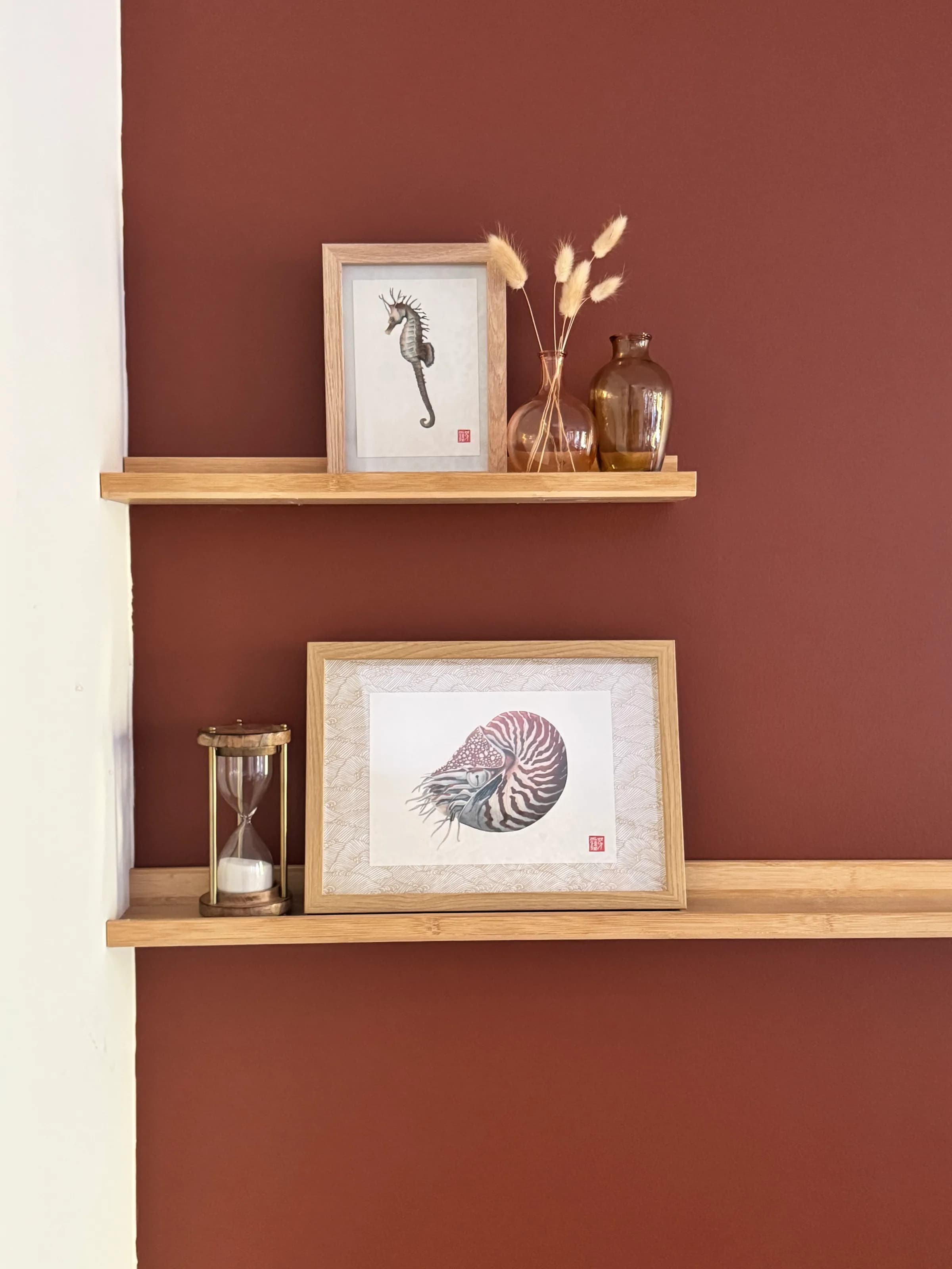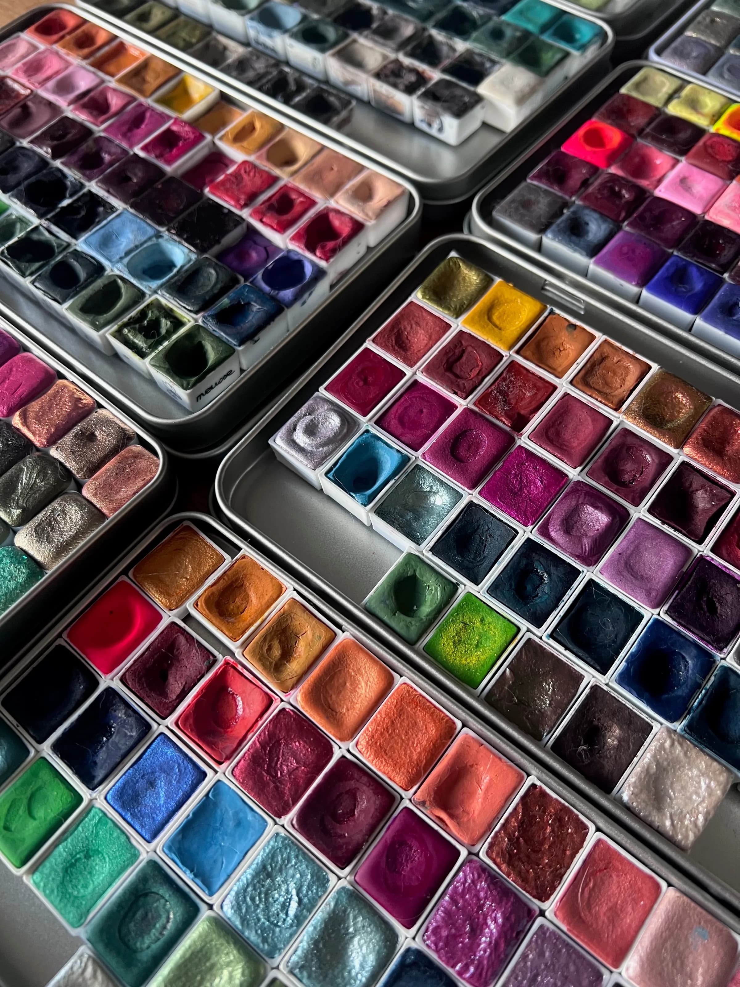
After years of testing, accumulating and refining, here's the kit I actually reach for every day.
Before we start, something I care about saying clearly: what follows reflects my own experiences and personal preferences above all. There are plenty of excellent materials I don't mention here (either because I haven't tried them, or because they simply don't suit the way I work). None is better than another. I don't claim to have tried everything, nor to hold the truth on the subject. This list is an invitation to explore, not a model to follow, and it will certainly keep evolving as I discover more.
Paper
Let me start with a confession: I painted my first watercolors on the paper of my bullet journal. And if you've ever tried, you know exactly what I'm talking about, paint drying far too fast, pages buckling, blends that are simply impossible…
Watercolor needs the right paper.
You hear it often, and I won't contradict those who said it before me: in watercolor, paper matters more than anything. More than brushes, more than colors.
I painted for a while on Canson Montval (a cellulose paper, honest enough to start with) before moving to 100% cotton, the best paper for watercolor. Cotton paper is certainly more expensive, but it's also the one that genuinely lets you progress, in my opinion.
One tip to bring the bill down: buy large sheets and cut them yourself to the sizes you need. It's noticeably cheaper than buying ready-made blocks. I even tried a roll: that's a bit extreme, and not necessarily the easiest thing to store and handle.
My favorite papers
-
Arches 300 gsm, cold press, 100% cotton: my favorite, without hesitation. I use it in 31×31 cm, 20×20 cm, A4 and 31×41 cm.
-
Winsor & Newton 300 gsm, cold press, 100% cotton: a very good alternative, reliable and accessible.
-
Lanaquarelle cold press: slightly less textured than the previous two, but very pleasant to work on.
And if you ruin a sheet?
The price of cotton paper is intimidating, and that's normal. But a "failed" sheet is never really lost. In my studio, I keep a little box for my unsuccessful attempts (yes, that happens far more often than you'd imagine). I dig into it whenever I want to test a color, explore a technique or prepare a swatch chart. Seeing how your pigments behave on the very paper you're about to use is valuable information.
Sketchbooks
Working in a sketchbook is another way of creating with watercolor. More spontaneous, more portable. I have two that I use regularly:
- Etchr sketchbooks in 230 gsm cold press: I was a little skeptical at first about the weight, but I was very pleasantly surprised, it barely buckles. The texture is subtle compared with Arches paper.
- Sketchbooks from Une Envie de Papier: made to order by Hélène. Last year I ordered a 20×20 sketchbook with a Japanese paper cover and Saunders Waterford paper inside. You choose the format, the cover, the inner paper. I love it!
Brushes
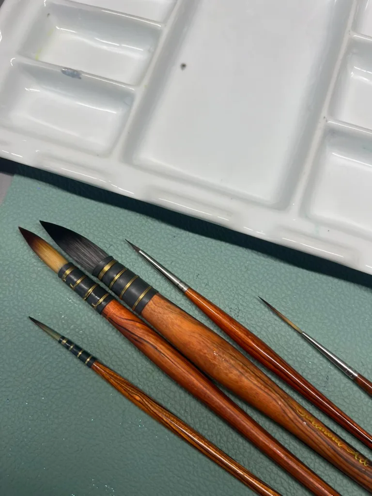
First things first: brushes are the most personal tool there is. The ones I love may well not suit you, and that's fine. What I describe here is the result of a lot of testing, experimenting and habit.
One thing to keep in mind: unlike paper or paint, the brush isn't what determines the final look of your watercolor. It shapes your comfort, your gesture, your way of working, but it won't directly change the end result.
Springy or soft hair, what's the difference?
- Springy hair barely deforms under pressure; it holds its shape and snaps back.
- Soft hair flattens more and hugs surfaces more readily.
Neither is better: it all depends on what you're after in your gesture.
Today, my everyday brushes are almost all Schimoni, a Swiss brand I discovered several years ago and whose ambassador I became in 2025. Here are the models I use:
- Quill & Soft Quill: my main wash brushes, in sizes 1 and 5. I eventually got the hang of the Soft Quill's slightly softer hair, and now I pick between them depending on my mood and the surface to cover.
- Mini Quill: my absolute favorite for small areas that still need a good water reservoir. I've never found an equivalent.
- All Rounder size 2: the one I reach for on every small detail.
- Rigger Brush size 2: for fine, linear strokes.
Before finding this brand, I worked a lot with the Escoda Perla and the synthetic range from Silverbrush: two very good options if you're looking for fine, springy round brushes.
My specialty brushes
- Rosemary Small Eradicator flat watercolor brush: I use it more and more, not only to lift color, but also to smooth the slightly uneven edges of certain shapes. A discreet tool, but genuinely useful.
- Escoda Perla series 1580 angled brush, size 6: very handy for lifting, with an angle that allows lovely precision.
- Princeton Neptune 1" synthetic squirrel mop: the one I take everywhere when travelling. Small, light, perfect for wetting a sheet quickly. Day to day I prefer my large Schimoni, which holds more water.
Colors
Let's start with a number: I have more than 300 colors in my studio. Yes, 300. You could call it an addiction, and I won't argue.
But before going further, I can already hear the comment: "with that many colors, you must never mix anything anymore?" I do, actually. Having a large collection has never replaced the search, that moment of fumbling, testing a combination, failing and starting over until you find exactly the green you had in mind. Some colors are fascinating as they are, but others reveal something unexpected in a mix. It isn't one or the other: it's both, with a wider range of possibilities.
This collection was built over the years, through discoveries, crushes and a genuine fascination for what happens when several colors meet on paper.
French handmade watercolors
This is by far what I prefer. Handmade watercolors are produced in small batches, often by passionate women, with carefully selected pigments. The result: colors you won't find anywhere else, effects impossible to reproduce industrially, and a way of supporting craftsmanship that deserves to exist.
- Atelier Couleurs Grenadine: original collections, full of granulating and duochrome colors. My favorites: Bleu Russe, Papillon Noir, Exotique, Torride, Jaspe.
- Les Couleurs VF: very high quality, with a nice balance between classic and granulating colors. My favorites: Écorce, Grue Cendrée, Agapanthe, Fougère, Rivière.
- Le Pigmentarium: more transparent shades, some with lovely pearlescent sheens. My favorites: Avalon, Hullo, Praline, Néréïdes.
- Jardin d'Aquarelles: highly pigmented, intense, excellent in mixes. My favorites: Matcha, Pumpkin Spice, Bourgogne.
What is granulation?
Some pigments, instead of settling evenly, form small irregular clusters as they dry, that's granulation. The effect can be subtle or very pronounced depending on the pigment and the paper. On cotton, it's particularly beautiful. It's one of the most fascinating effects in watercolor, and one of the reasons some handmade colors are so addictive.
Sparkling watercolors
A category all of their own, because I love using them to add a touch of light and texture to my watercolors. Sparkles change everything in the light: a painting that looks ordinary can become surprising from a different angle.
- Sparks Aquarelle: beautifully crafted themed collections, with varied sparkle shapes and results that really differ from one color to the next. My favorites: Tituba, Rêve Hivernal, Sylve Dorée, Frondaison, Kogarecha.
- ClaireChi: original, luminous, very creamy. My favorites: Sweet Grass, Sparkling Teal, Osmanthus, Hibiscus.
- Lisilinka: ultra luminous, very densely sparkling. My favorites: Cashmere and Moon.
Commercial brands
- Schmincke: creamy and easy to rewet. Their Supergranulation range is really worth a look.
- Daniel Smith: my favorite commercial brand, and the only one I still use now. The colors made from genuine minerals, like Green Apatite Genuine or Serpentine Genuine, are in a category of their own. My favorites: Lunar Blue, Burnt Umber, Green Apatite Genuine, Serpentine Genuine, Undersea Green.
I also recently tried A.Gallo: I really liked the variety of their colors, some more classic than others but all enjoyable to work with, with opacity levels that vary a lot from one color to another.
Where to start as a beginner?
You don't need 300 colors to paint well, that much I can promise you. Start with a limited palette of 10 to 12 quality colors (artist grade if possible), then build it up gradually according to your favorite subjects and the effects you're after.
Other tools
Beyond the classic materials, there's a whole set of tools that have slipped into my daily practice and that I couldn't do without anymore.
Ceramic palettes
I never really liked mixing my colors on plastic or on the metal of classic watercolor tins. Ceramic is something else: color spreads better on it, mixes flow more smoothly, and cleaning is disarmingly easy. Not to mention how it looks.
- Pottery With Soul XL watercolor palette, Valentine model: my favorite. A few small wells and a large central mixing area, with non-slip feet. Practical and beautiful at once.
- Meeden porcelain palette, 13 wells, flower shape, Ø 20 cm: very good, but the wells are a bit too deep and the central mixing area a bit too small for my taste.
- Meeden porcelain palette, 8 wells, rectangular, 17.5×13 cm: same verdict. Well made, but not ideal for my working habits.
- Boesner rectangular porcelain palette: the slightly sloped wells make pigment slide to the bottom, which makes it poorly suited to mixing. I use it instead to keep small amounts of my tube greens: it has become my dedicated green palette.
No need to spend a lot: a small ceramic tray or a white plate does the job perfectly. I found a rectangular tray at Monoprix that I still use regularly. What matters is the surface, not the label.
I use several in parallel depending on the number of colors and the projects in progress. Since I work a lot in series, it's especially practical: no cleaning between two paintings, and no wasted pigment if I feel like changing color combinations along the way.
Preparing the drawing
I'll be honest: drawing is clearly not my favorite part. Proportions give me trouble, and I simply haven't practised drawing enough to feel truly comfortable with it.
So I prepare all my sketches in Procreate on iPad. The software lets me correct, adjust and start over without ruining a single sheet. Once the sketch is ready, I print it out or trace it directly from the screen.
For tracing, I use a backlit light pad: the Gaomon GB4.
Pencils and erasers
For sketching on paper, I use a 0.35 mm mechanical pencil with H or HB leads.
To erase or soften lines:
- A Tombow precision eraser for small sketch adjustments
- A kneaded eraser to lighten the sketch lines before painting, so they don't show once the watercolor is finished
Watercolor paper may be thick, but the fibre remains fragile. A pencil line pressed too hard can deform it and mark your paper for good. The light pad lets me produce a precise drawing that needs little to no reworking. The kneaded eraser is handy for lightening lines: you "dab" it on the sheet rather than rubbing. That way the paper stays intact and you avoid nasty surprises once you start painting.
Colored pencils and pens
With apologies to watercolor purists, I find it's sometimes difficult to reserve small white areas. So I often use colored pencils or white pens to add a bit of light.
For colored pencils, I've tried several (Caran d'Ache, Faber Castell, Lyra…) and I don't have a particular preference. Having one water-soluble and one non-water-soluble can be useful depending on the effect you're after.
For white pens:
- Sakura Gelly Roll white 0.5
- Uni-ball Signo Broad white rollerball
- Neopiko Line White ballpoint: recently tested and already a fan of this pen, both fine and very opaque. Shame it's so hard to find!
For fine details and small handwriting in my sketchbooks:
- Sakura Pigma Micron in several shades and sizes (005, 01 in black, sepia…)
- Uni-pin black fineliner 003 or 005
The magic eraser sponge
Genuinely useful for rescuing small unwanted marks. It has its limits, it doesn't save everything, but it gets you out of trouble.
Masking fluid
After testing several, the one I prefer is Jacques Herbin. The colorless Schmincke is also very good but harder to apply precisely, since it goes on white.
To apply masking fluid, I use a rubber-tipped brush from AMI, in size 2.
Masking tape
Washi tape, painter's tape, rice paper tape… What matters is how you use it. Take the time to lay it down properly, pressing firmly into the corners. Before peeling it off, make sure the watercolor is completely dry. Don't hesitate to use a hairdryer to warm the adhesive, and above all go slowly.
Some papers, even with every precaution in the world, tolerate neither masking fluid nor masking tape. Remember to test on a scrap first.
My signature seal
An article will be dedicated to it soon. As for inks, I use:
- VersaFine Clair ink in red "Fraise"
- VersaCraft ink in red "Cherry Red"
- VersaFine ink in orange-red "Habanero"
The author
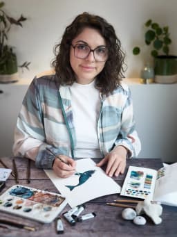
Méloée Lassauce
Self-taught watercolour artist based in Luxembourg. I write here about the materials I actually use, the techniques I practise and the mistakes I made before you did.
More about the studioSupport the studio
A free-amount donation, no account needed, to keep sharing watercolour.
Make a donation